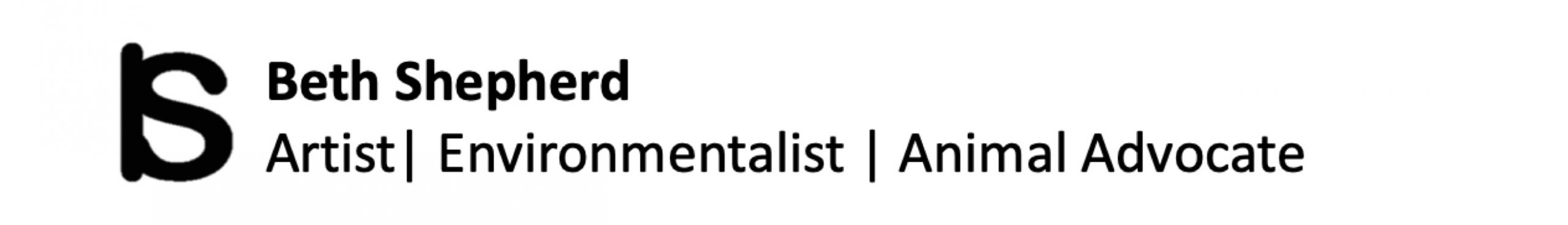
Diana Thoreycroft was back in town in late September for the opening of her show HERD at the Ottawa School of Art Gallery at the Shenkman Centre, Ottawa. On Saturday, September 24, I, with a number of other Ottawa artists, got to spend a day with Diana in an experimental drawing studio. It was lots of fun. The next day I came back to hear Diana’s artist talk on HERD and the influence of the grotesque in her work. HERD is an installation of over 100 altered plastic horses running along a ramp. Also included in the show is a series of photographic works that include the horses in some unsettling way. I am sure there will be more of these!
Diana is perhaps best known for her humorous Group of Seven Awkward Moments series but it is her controversial People’s History series that has already put her in the Contemporary Canadian art history curriculum. You can see more about her work on her website.
First seeing her work at that Carleton University Art Gallery in 2010 motivated me to take an experimental drawing summer studio course with her the next summer at the Ottawa School of Art. During that week, Diana pushed us to carry out some meaningful “intervention art.” It was this project that started me on my path of animal advocacy and my Pigs in a Post Modern World series (see my other website Art that Makes a Difference.)
Thanks Diana for your ongoing friendship, influence and inspiration!
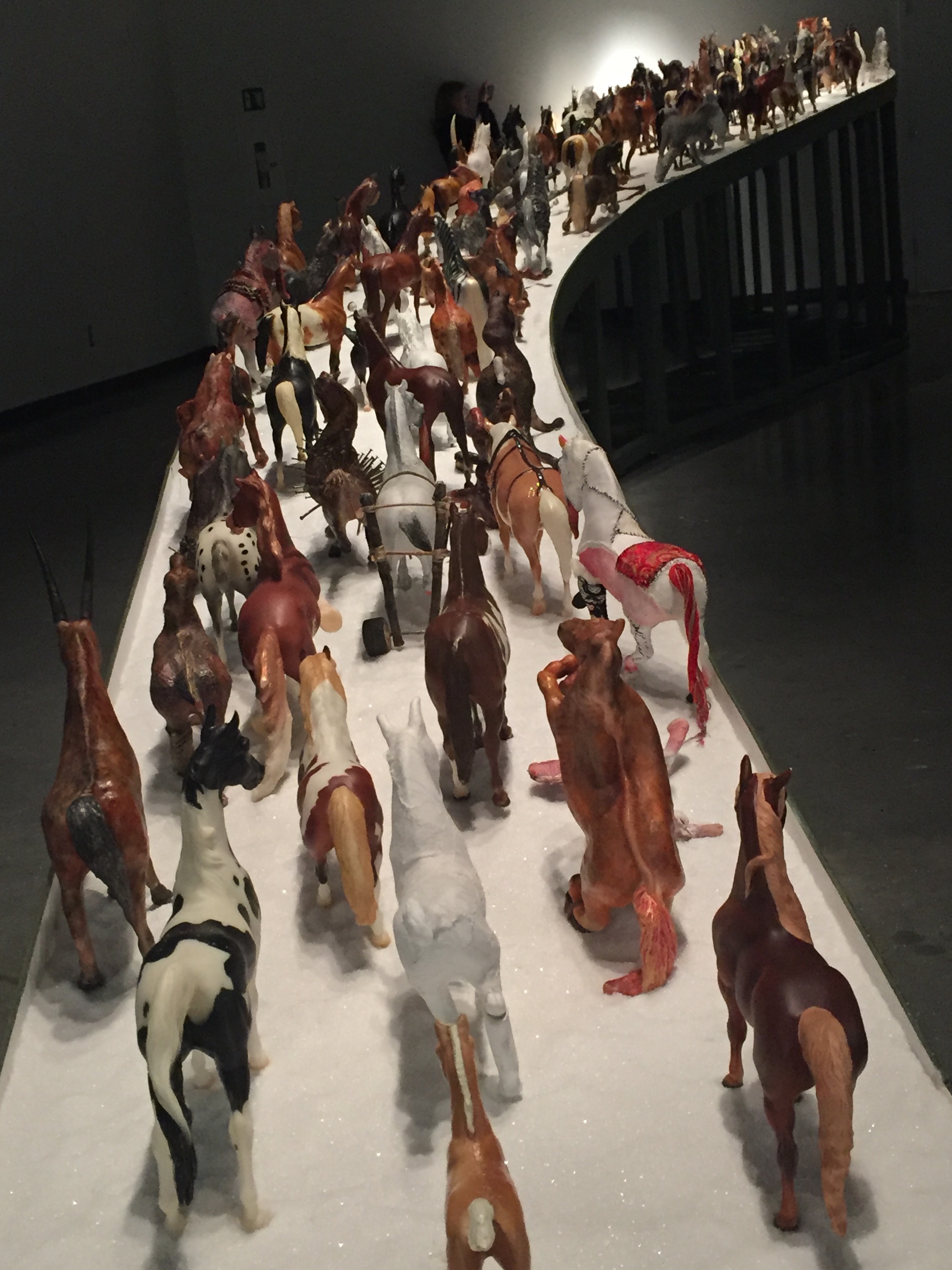
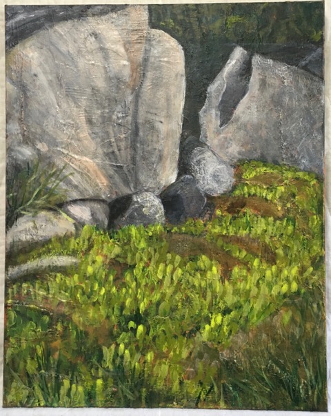
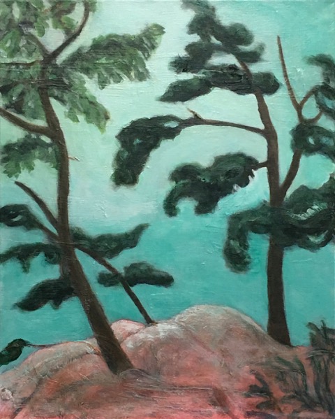
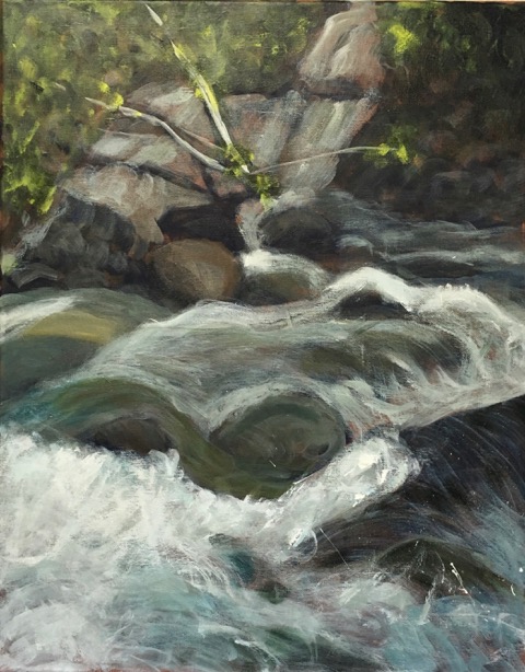
Landscapes are not my favourite subject for painting. I think it is hard to do justice to the great outdoors. Nevertheless in preparation for a painting trip to Provence, I enrolled in a landscape course at the Ottawa School of Art with Instructor, Blair Paul. Blair taught us a straight forward approach for creating pretty impressive lanscapes without a lot of rework. The process starts with a background of burnt siena. First create a value drawing in ultramarine blue. Next start building layers of colour from dark to light until the essence of the landscape is captured. The piece de resistance is the sky. Using lots of white and yellow and touches of other colours, quickly work the sky, adding tree holes and reflections to finish off.
Here a some of the paintings I created during the course.
My Line series, as discussed in my last blog, was in part inspired by Sol LeWitt who believed that lines were real whereas a portrait or landscape could at best be a mimetic representation of nature. But even lines can be deceptive.
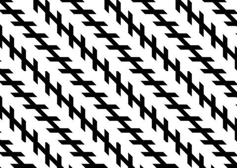
Figure 1 shows the Zöllner illusion, a classic optical illusion named after its discoverer, 19th century German astrophysicist Johann Karl Friedrich Zöllner. In this figure the black lines seem to be unparallel when in reality they are. The illusion is caused by the shorter lines crossing the longer ones on an angle. Interestingly, if the illusion is printed in green on a red background the distortion will disappear.
Figure 1: Zollner Illusion
I first came across Zöllner lines in a catalogue of works by Carsten Höller (b. 1961), a Belgian artist. Höller, whose work often challenges the notions of where and how art is displayed, created an optically disorienting space entitled Zöllner Stripes (2001/2007). I was not interested in creating optical illusions or challenging the notion of art institutions but I did love the form of the Zöllner lines. By focusing on one Zöllner line any illusion could be avoided and the line would remain straight, powerful and real.
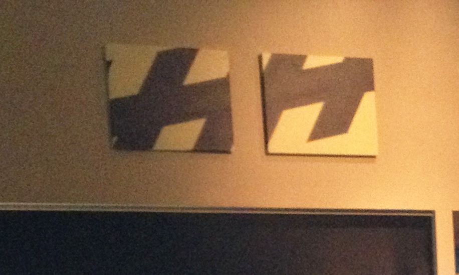
In 2014 I painted the two canvases incorporating snippets of Zollner lines using layers of semi-transparent colour to produce a subtle glowing effects. When the two original paintings were hung at Ital-Delli, a restaurant in Mt-Tremblant, I was dissatisfied at how small and insignificant they looked (Figure 2.) All the time and care taken on the subtle colouring was lost when the works were hung high above the viewers under the cathedral ceiling.
Figure 2: Zöllner Diptych, 2014
Late in 2015 we removed these paintings with the intent to expand them into a larger more visually powerful artwork reflective of the architectural space. Two additional canvasses were prepared by painting a number of undercoats in red and green. Then black and a rich cream colour of yellow ochre and white were applied to all four canvasses. Finally, the black forms were outlines in narrow lines of green and red to create a slight shimmer at the edges.
Three+One is approximately 2 feet high and 10 feet in length. Three paintings are bound together as a triptych and the fourth offset approximately 10 inches to give the illusion that the lines are continuing perhaps ad infinitum. Figure 3 shows the new work hanging again in Ital-Delli and looking much more commanding in its original space.
Figure 3: Three+One (Zöllner Quadratych), 2016
Painting, even hard edge painting, retains residue of the artist’s hand. Layer upon layers of colour and medium result in a glowing effect that goes beyond what is possible in commercial production. Repetition, variation and the coming together of the whole is the process of art.
Colours of South Palm Beach are two mixed media paintings I did after returning for a short sojourn to South Palm Beach — a lovely residential area on the east coast of Florida between West Palm Beach and the Atlantic Ocean. It was wonderful hearing the surf and watching the changing colours of the ocean for a week while in Ottawa we had the biggest snowfall of the season. Thanks to our friends, Murray and Bryna, who invited us to stay with them and showed us great hospitality.
Here is a panorama view of the beach I walked every day.
My paintings combine some mysterious collage pieces integrated with layers of acrylic paint and mediums applied with different tools. The works are at the Atrium Gallery in Ottawa from May 21– June 22, 2016.
Perhaps coming to art from a science and technology background I am naturally drawn to the structure and order of geometric abstraction (see note below). From time to time in my art career I have returned to science and technology as a source of inspiration and regeneration. In 2005 I used computer graphics to make my own “Chromatic Accelerators” inspired by Canadian artist Claude Tousignant to enliven my home gym.
Art and science share common processes of inquiry, experimentation, visualization, theory construction, testing and revision. Both science and art work within, yet outside of, the bounds of socio-political environment, with the aim of pushing boundaries of knowledge and understanding (Stephen Wilson, Art + Science Now, 2010).
In my studies of art history I discovered that many great artists, most notably being Leonardo Da Vinci, recognized the interrelationships between art, science and technology. I have been inspired by two Modern artists in my forays into geometric abstraction. The first is Sol LeWitt (1928-2007) an American Minimalist and Conceptual artist, and the second is Kazuo Nakamura (1926-2002), an Abstract Expressionist landscape painter who sought to reveal the underlying fundamental structures of nature. Nakamura was thoughtful and rational about his work and avidly sought integration of science and art to reveal the underpinnings of nature rather like the scientists that were revealing new knowledge about the atomic structure of matter in the mid twentieth century.
Sol LeWitt started his career as a graphics designer and his early work in the field of architecture influenced his both his use of two- and three-dimensional structures and his attitude about the artistic process. As in architecture, LeWitt separated the concept planning stage from the execution stage in his art practice. To that end, he provided instructions to others to execute his geometric projects and became best know for his instruction-based wall art.
As part of an art history essay I was writing — “Sol LeWitt: Work from Instructions” — I undertook to do my own Sol LeWitt work of art, working from his written instructions used in project he did with the Nova Scotia College of Arts and Design. Just as NSCAD students working with the master printers produced a series of lithographic prints in 1971, I produced my own rendition of one of these works while learning lithography at the Ottawa School of Art in 2013.
Lithographic Print Process for “Fifty Dots Joined by Lines”
Concurrently in my art practice I was beginning a project on Geometric Art inspired by the work of Dutch artist and printmaker Michael Berkhemer (b. 1948), called Works in Progress (2002). Berkhemer’s large prints were simple and clean in form–just lines–but complex in the use of pattern and colour. I recalled a great Sol LeWitt quote: “Obviously a drawing of a person is not a real person, but a drawing of a line is a real line” (Sol LeWitt, in an interview by Andrew Wilson, Art Monthly, 1993). I also thought of how important the line is metaphorically: Don’t cross that line, the end of the line, tow the line, what’s my line, hold the line, deadline, flat line, red line, by-line, beeline, infinite line… and the possibilities seemed endless! The light came on – I had the idea that gave rise to my ongoing body of conceptual geometric abstraction I call Line Work.
Here are a couple of examples.
Line Work: Crossing the Line #3, 2014Line Work: Geo-Arrow, 2014
Creating and perceiving art have a lot to do with personality. Not everybody will like the same things. I believe that art is not just about pleasing the eye or releasing emotions but like Sol LeWitt and Kazuo Nakamura, I believe that art should stimulate the mind of the viewer. I hope my art and essay achieve this end. Let me know.
Geometric Abstraction: refers to the use of simple geometric forms placed in non-illusionistic space combined into nonobjective compositions. It in its many forms evolved out of the Cubist process of purifying art by removal of the vestiges of visual reality and focusing on the inherent two-dimensional nature of painting. Geometric abstraction took many forms in Western Modern Art: Malevich’s Suprematism in Russia, Mondrian’s Neoplasticism and Bauhaus influences in Europe, peaking with Minimalist art of the 1960s. (Magdalena Dabrowski, Heilbrunn Timeline of Art History, The Metropolitan Museum of Art, 2004).